Home » Kevin Vitali Massachusetts REALTORS-Real Estate Blog » Home Selling Advice » Sneaky Staging Tips for Selling A Smaller Home
Sneaky Staging Tips for Selling A Smaller Home
Good things come in small packages, some say; but how many people would actually agree with this statement, especially in real estate? Potential buyers most certainly wouldn’t, that’s for sure.
Cozy, adorable, warm, compact – these are all adjectives known to us as perfect euphemisms for cramped, claustrophobic and cluttered, and we can no longer be so easily fooled into settling for a smaller home than we have initially planned on buying. So how come we see more and more people joining the tiny house movement? What’s the reason for an increasing number of people recognizing the benefits of a smaller home?
A professional real estate agent will say – it’s all about the presentation. When buyers see the list of benefits – reduced costs, decreased maintenance, simpler and more practical lifestyle – they start reconsidering their original idea to move into something bigger than they actually need.
Still, many will not just take your word for it, and will have to experience these welfares themselves to know that reducing the number of square meters is not a sacrifice, but quite the opposite – a smarter decision.
This is where you pull out all the design tricks that you have up your sleeve to charm the family and make them fall in love with the cozy and adorable home.
Taking Advantage of Minimalism’s Full Potential
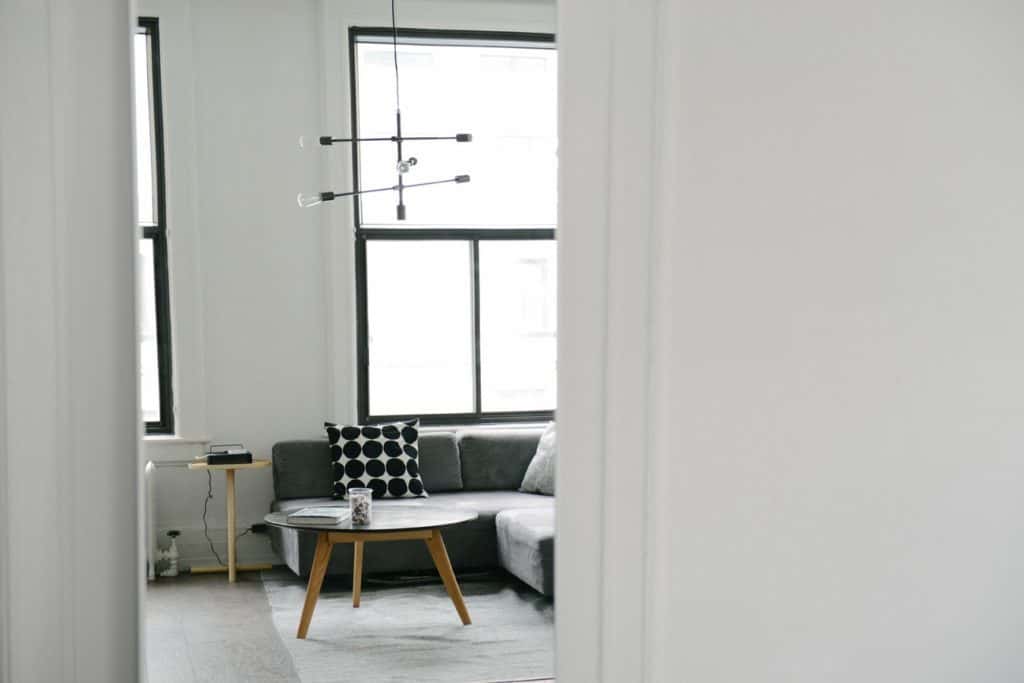
Just as Millennials became the majority of property buyers, agents started looking into trends that this generation is most fond of – and minimalism seemed to take over every single aspect of their lives. So how can you achieve an all-round simplicity of a home you are staging?
Blending the Colors
Source: unsplash.com (free to use and share, no attribution needed)
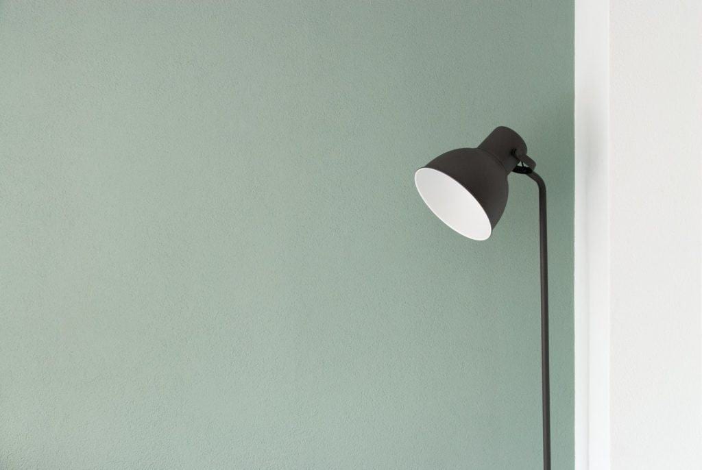
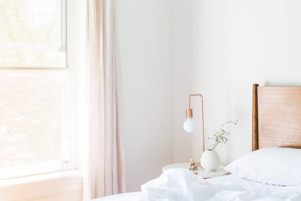
While painting the entire home in one color to some seems rather monotonous and unexciting, it does wonders in limited living spaces. Even though color blocking can add interest to interior design and create warmer atmosphere, at the same time it makes the entire space kind of choppy, and as a result, much smaller.
Source: pexels.com (free to use and share, no attribution needed)
A single color gives a room a continuous feel, instead of separate, clearly defined sections that only make it more evident that the space is small. The same rule applies to accessories and decorative pieces – reduce the contrasting colors and opt for shades of the same one that will create a more exciting atmosphere, but maintain the flow.

Source: pexels.com
Make sure the different shades come in geometric patterns and simple vertical and horizontal lines that will in a way stretch the room. Go for a stripy pattern on your linens, lamp shades, and/or curtains, and expand the visual boundaries of the enclosed space.
Removing the tchotchkes
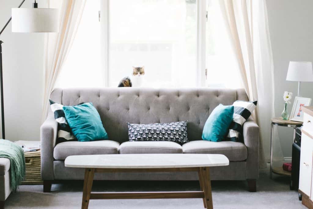
A large leather couch with dozens of printed cushions? A barely visible coffee and bedside tables filled with a multitude of scented candles? At least two rows of figurines on every single shelf in the house? Though on the one hand stuffing the place with countless personal items makes it feel homelier, when staging a house for sale these will only make it seem more cramped.
Now is the right time to box everything up in affordable storage units in order to keep all countertops, cupboards and built-ins clean. If you’re not so sure where to start, try with “smaller than the football” rule – and rid of everything small in size that you don’t really use on a regular basis.
Out with the Rug
Source: unsplash.com (free to use and share, no attribution needed)
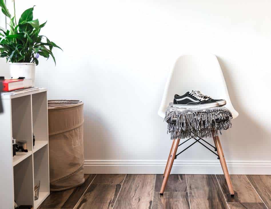
While on the subject of redundant items, you might consider removing all the rugs. In open-floor plans, smaller, cut-out rugs help highlight several focal points, but when you don’t have much square meters to work with, they can only dwarf the space.
Out with the Ds – Doors and Drapes
If you have heavy drapery fabric standing between the sunlight and the interior, our first instinct would be advising you to remove them completely, leaving the windows completely bare. Now, if you are working an apartment space, it is highly likely you’ll be having neighbors on the other side looking in – if that is the case, you might just want to substitute the Matte Chenille or Velvet drapes for a sheer and lightweight ones. And to add a bit of height to the room, hang the drapes as high as possible to create an illusion of a sky-high ceiling.

Source: pexels.com (free to use and share, no attribution needed)
When it comes to removing the doors – it may seem radical and not an advice you would come across as often, but we do ask you to trust us on this one. The farther you can see, the better it will be, the bigger it will seem, and faster it will be sold. Take the doors off their hinges, all except the ones that lead to bathrooms, bedrooms and closets, and remove the claustrophobic feeling in an instant.
Reflective Light
Once you clear the space from the items you do not actually use, and remove the doors and drapes that limit the amount of light that enters the room, it time to think about further illuminating the space. Cutting out additional windows is either an impossible or extremely expensive endeavor, but it does not mean there are no alternative options.
Source: unsplash.com (free to use and share, no attribution needed)
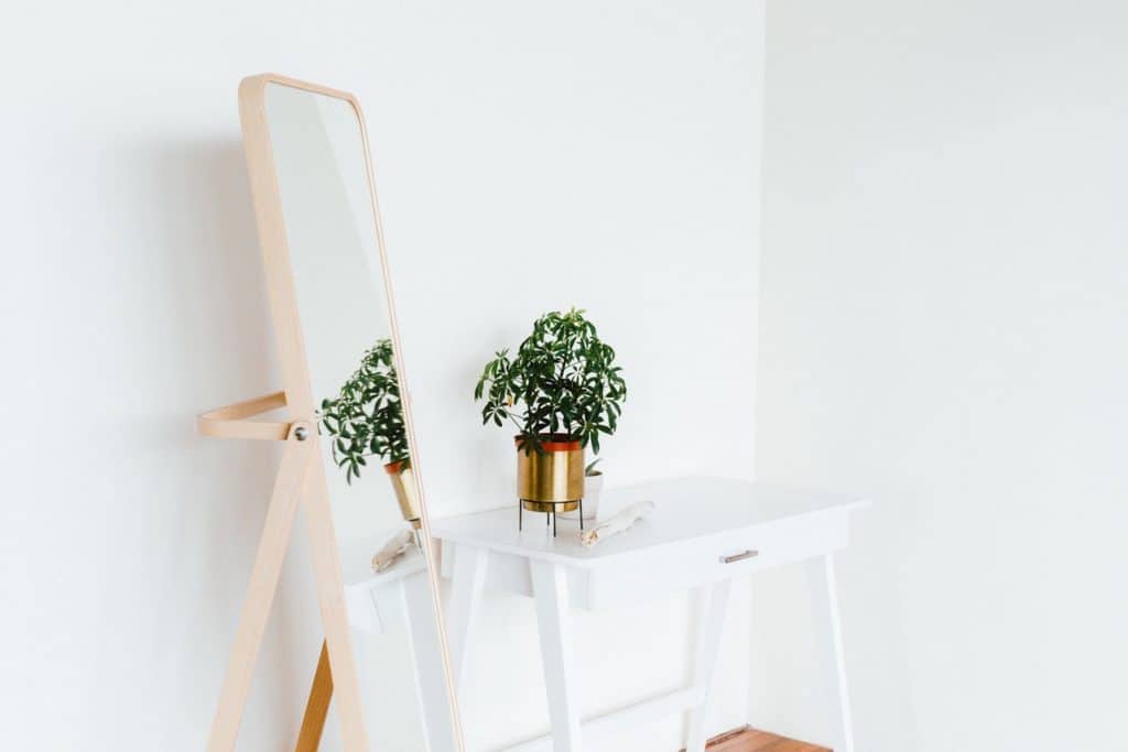
First, you might want to consider substituting your artwork for mirrors that will maximize the amount of natural light the room receives. Just remember to approach their placement strategically – ensure you put one opposite of the window or across the entrance door to trick the visitors into thinking there is more depth to the room.
Furthermore, you should ditch the antique wooden furniture and exchange it for more modern glass and metal furnishings that provide the same effect as mirrors. And not just that, they make the space feel more airy, instead of dark and gloomy.
Practical Furnishing and Smart Placing
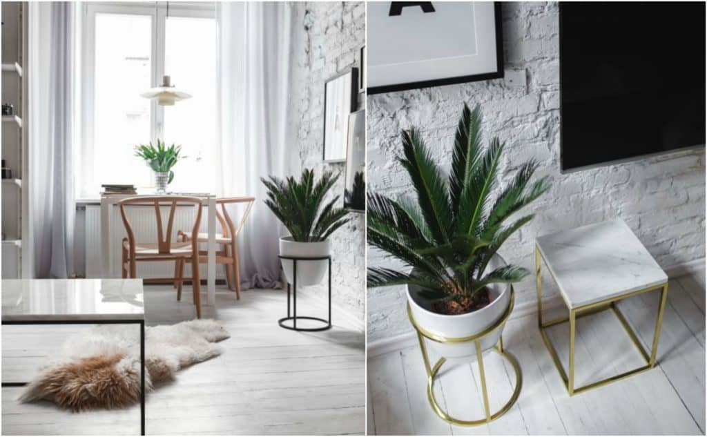
In recent years (or dare we say, decades) multifunctionality has been the in the limelight in design circles – space saving cabinets, folding beds, hidden storage units and space (and life) savers for those looking to convince others that tiny places have their hidden charms. No one could resist the unbelievably small New York apartment, and it is all due to the multifunctional pieces which allowed the owners to use every inch of the space efficiently. These modern furniture items add unique character, bring contemporary vibe and create utmost comfort.
Source: kaboompics.com
For the end, we’ve left one myth that we want to bust – pushing the furniture against the walls will not necessarily make the room feel larger. Quite the contrary, floating it away from walls and repositioning in order to group them into defining areas will make the space tenant-friendly and will add a more positive vibe to that dreaded cozy epithet.
The Bottom Line
There’s an opportunity waiting for you in every corner – in this jam-packed world we are looking for ways to take advantage of every square meter we are provided with. While no one can resist the cuddly feeling an adorably tiny room can create, more often than not, the poor design choices wake up the claustrophobic who lies in all of us, telling us to run away from the place we feel cramped in.
 Source: unsplash.com (free to use and share, no attribution needed)
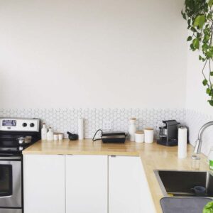
And when you’re a buyer’s agent trying to convince the family even the smallest place has limitless possibilities, you need to pull out all the stops. Location is not everything – presentation is, so prior to your buyer’s arrival, make sure all items are in their rightful, most optimal place.
Other Home Staging Resources:
- HGTV Sell The Benefits of Your Small Home
- Bill Gassett 18 Killer Tips to Sell a Home
- Kyle Hiscock 5 Tips for Selling a Unique Home
- Lynn Pineda Stage Your Home Like a Pro
- Eilleen Anderson Get Your Home Ready for a Smooth Sale
 This guest blog post, Sneaky Staging Tips for Small Homes, was written by Cate Palmer. Cate is a designer by day and a writer by night. Her fields of expertise could be summed up to interior design, architecture, and real estate related topics. Her interests are, on the other hand, wide and ever-evolving. These days Cate is quite passionate about 2018 design trends that will take over and dark chocolate. To see what she is up to next, check out her Twitter dashboard.
Want to make the most of preparing your home for sale? Call Kevin Vitali at 978-360-0422.


